A systematic method for surveying data visualizations and a resulting genomic epidemiology visualization typology: GEViT
Anamaria Crisan, Jennifer L. Gardy, Tamara Munzner
Accepted at Bioinformaticsdoi | gevit.net | code | ABPHM 2017 presentation | ASM NGS 2018 presentation
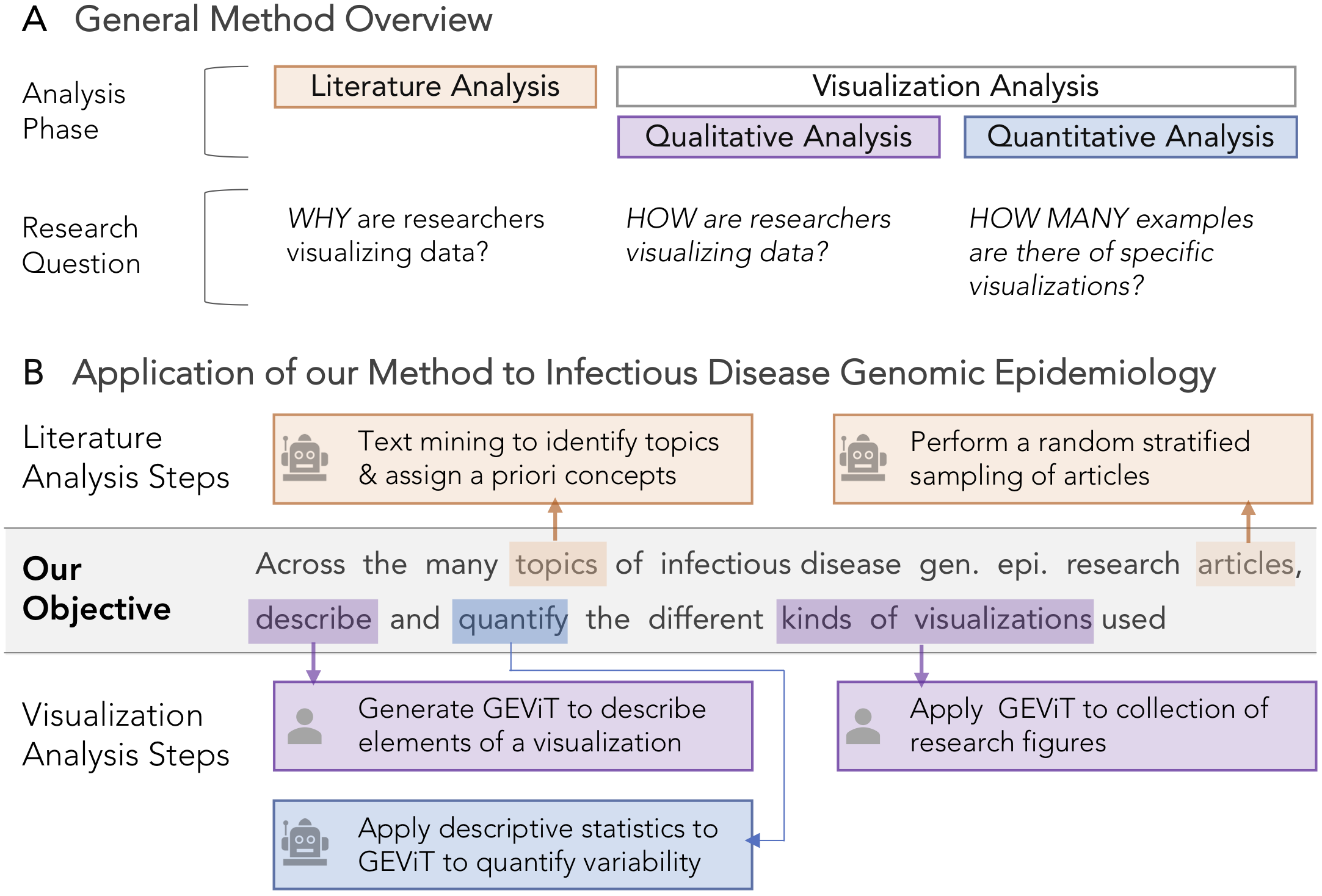 Method and Application Overview. A) Constructing and systematically analyzing a visualization design space requires analysis of both the literature and visualizations themselves, using qualitative and quantitative approaches. B) Automated steps, as indicated by the robot icon, are used in literature analysis to identify articles in genomic epidemiology and the topics those articles address. Manual steps, as indicated by the human icon, are used in the analysis of visualizations derived from those articles, followed by further quantification with automated statistical approaches.
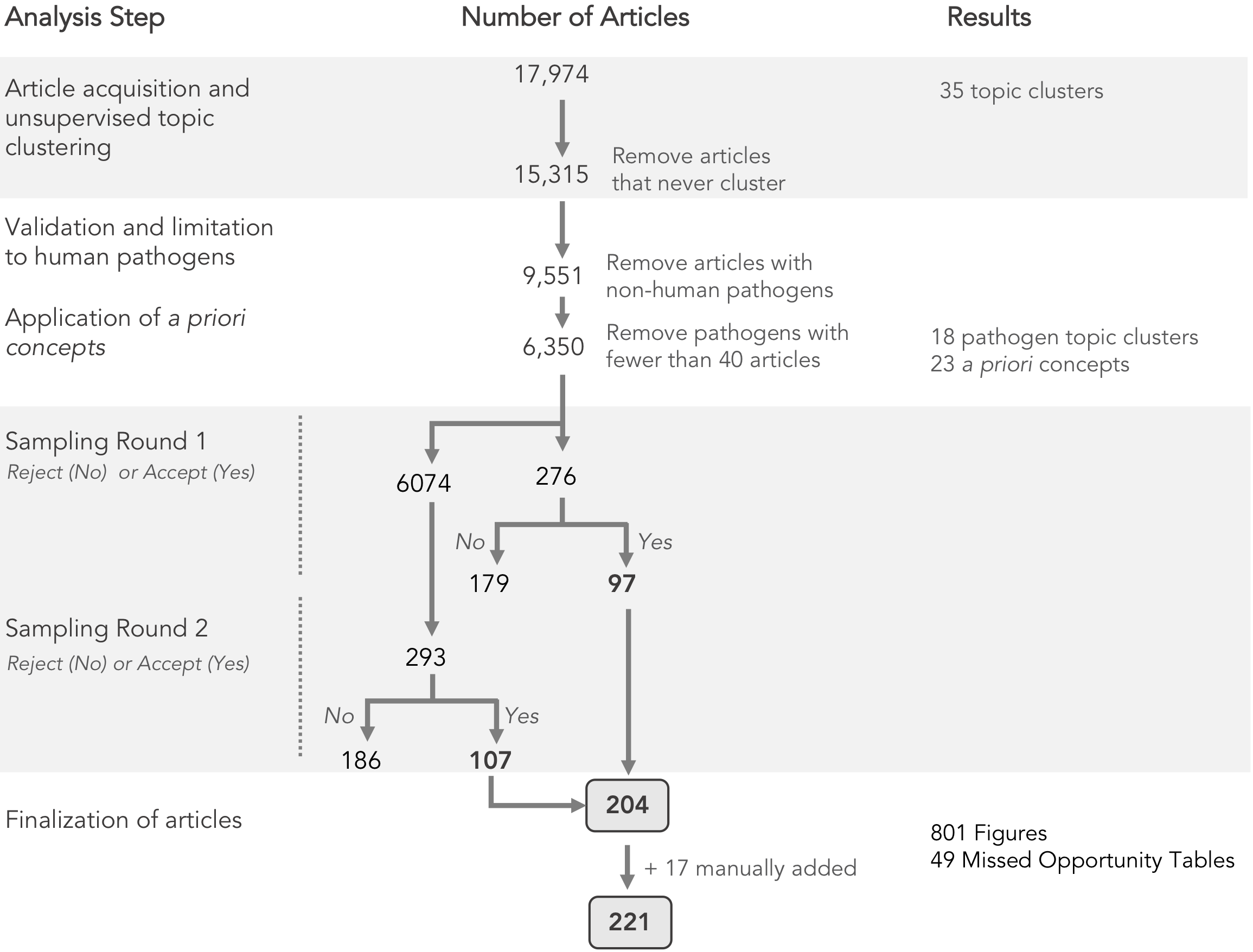 Summary of literature analysis steps and document sampling
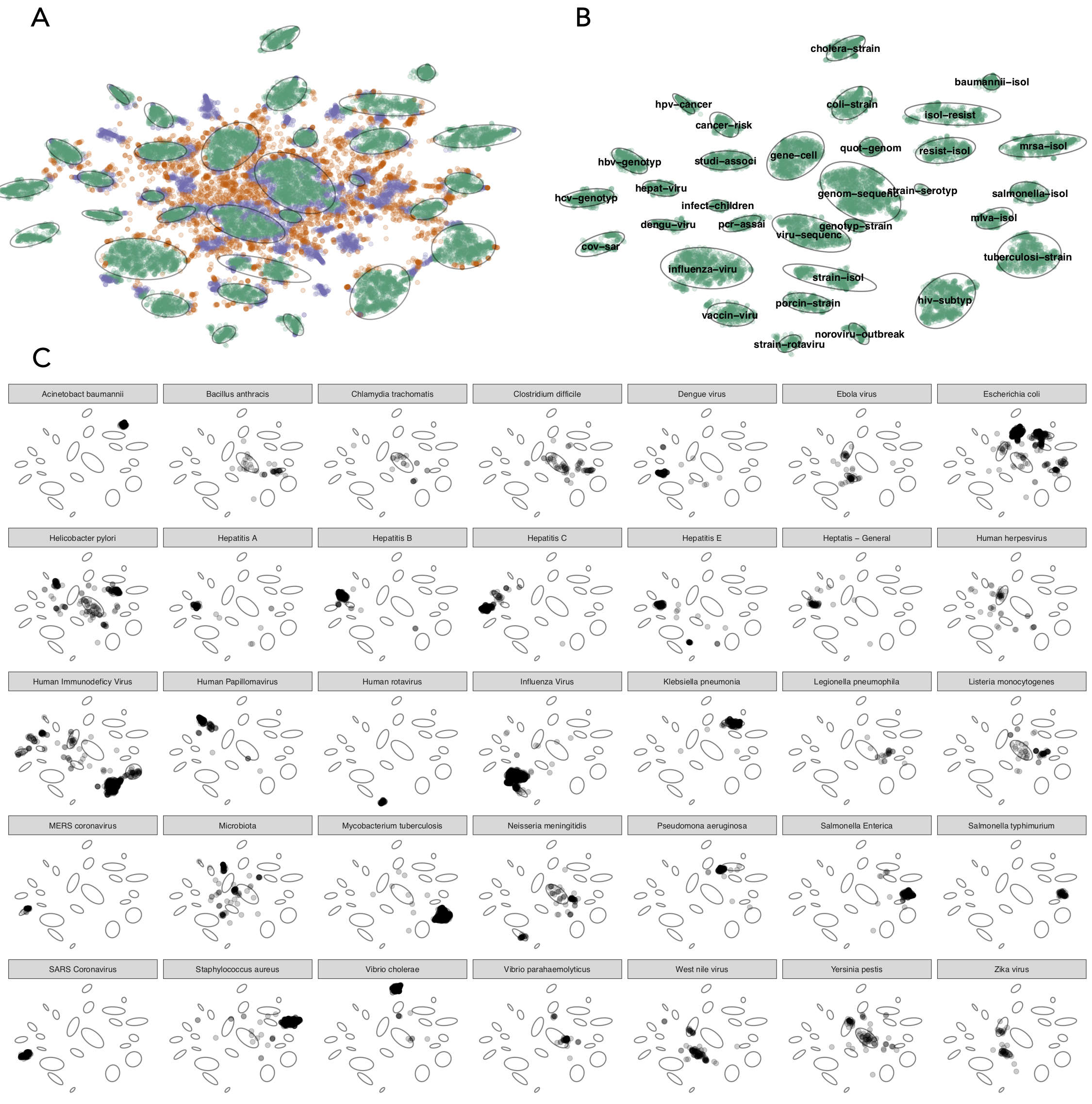 Summary of literature analysis results. A)Documents were classified according to whether they were part of a cluster (green), unclustered under current parameter settings (purple), or never clustered (orange). The 32 cluster boundaries were automatically determined and are shown as light grey ovals. B) Clustered documents and their topics, which are automatically assigned based upon top two terms with the cluster. C) Verification of cluster topics against an external list of pathogens. The small multiples show the distribution across the clusters of the pathogen named in the panel header, for the 35 pathogens with 40 or more matching documents.
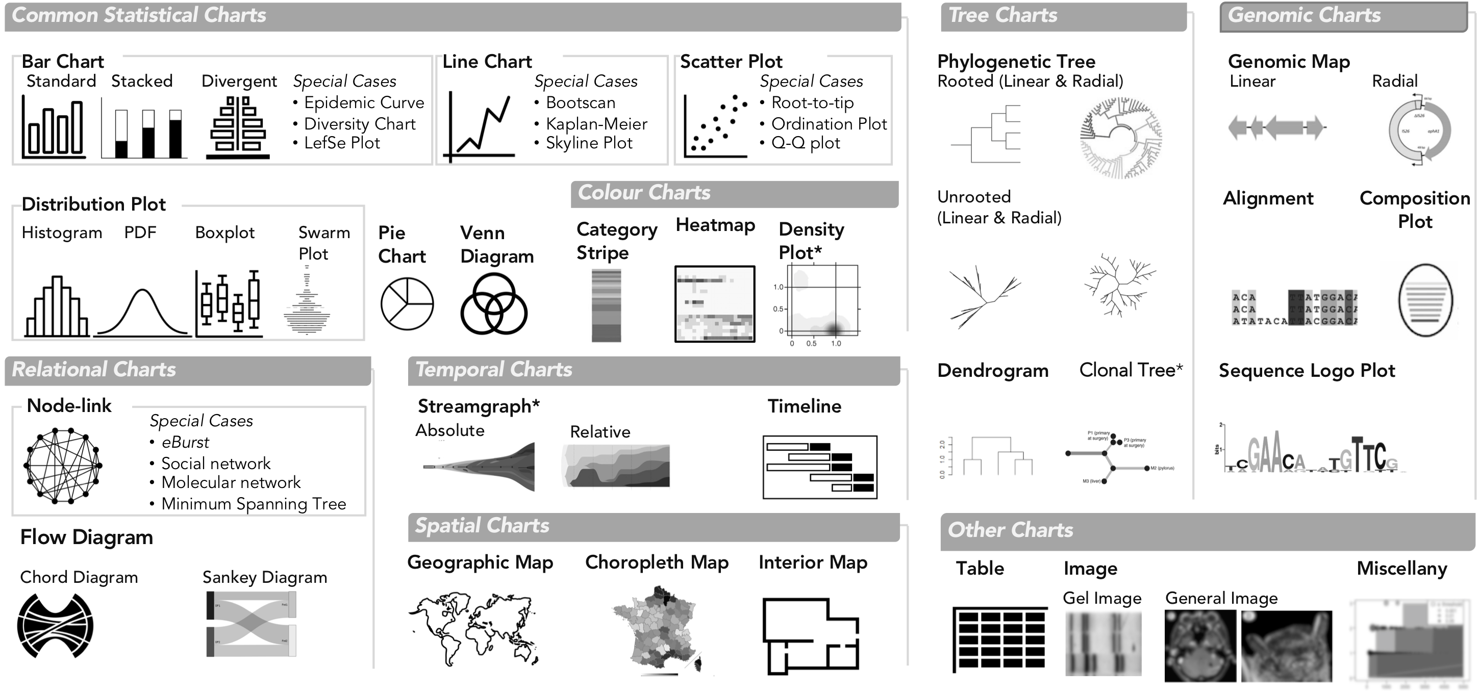 Chart Types in GEViT. We used common names for chart types and separated them into eight main classes and also one 'Other' class. Special cases of chart types were defined only when there were multiple instances of the same specific chart across our dataset. Chart types with an asterisk mark (*) indicate that they were included in the analysis through manually added articles.
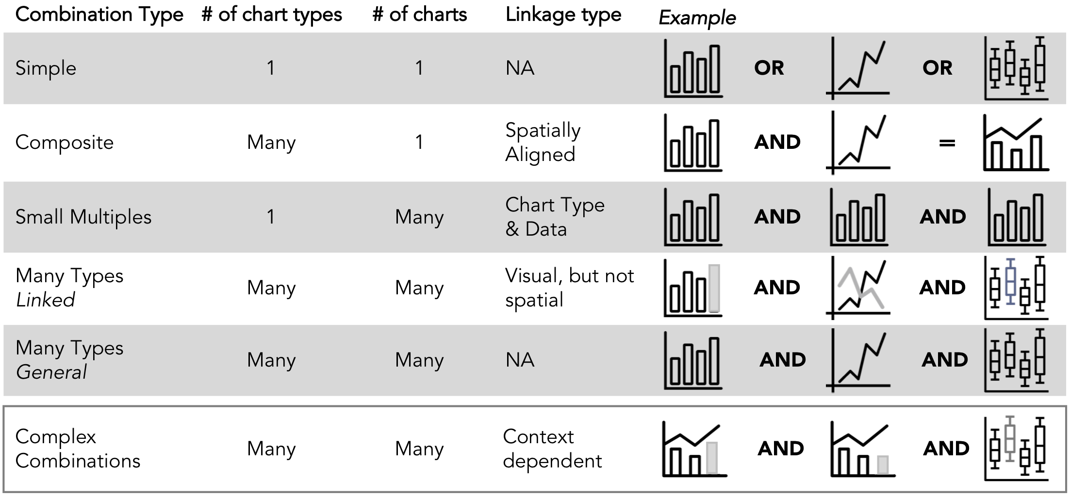 Chart Combinations in GEViT. The six combination types differ based on the number of chart types, the number of charts, and the approach to linking them together. Complex combinations are an amalgamation of the above five chart types â for example, a composite visualization that is represented as a small multiple and also linked another chart type
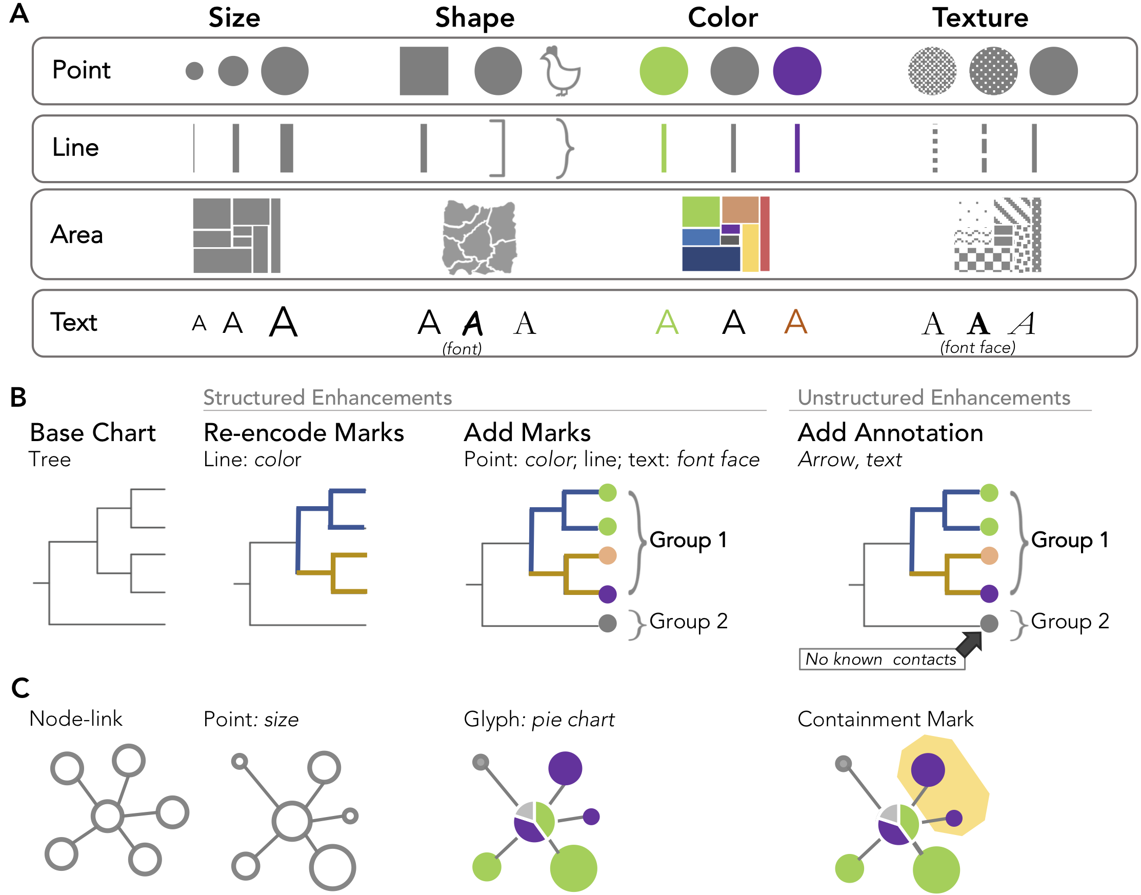 Chart Enhancements in GEViT.A)Our characterization of marks and their associated aesthetic properties is based on longstanding conventions in the visualization literature. Illustrative examples are shown for B) a tree and C) node-link chart types.
Abstract
Data visualization is an important tool for exploring and communicating findings from genomic and healthcare datasets. Yet, without a systematic way of organizing and describing the design space of data visualizations, researchers may not be aware of the breadth of possible visualization design choices or how to distinguish between good and bad options. We have developed a method that systematically surveys data visualizations using the analysis of both text and images. Our method supports the construction of a visualization design space that is explorable along two axes: why the visualization was created and how it was constructed. We applied our method to a corpus of scientific research articles from infectious disease genomic epidemiology and derived a Genomic Epidemiology Visualization Typology (GEViT) that describes how visualizations were created from a series of chart types, combinations, and enhancements. We have also implemented an online gallery that allows others to explore our resulting design space of visualizations. Our results have important implications for visualization design and for researchers intending to develop or use data visualization tools. Finally, the method that we introduce is extensible to constructing visualizations design spaces across other research areas.
Availability:
Our browsable gallery is available at http://gevit.net and all project code can be found at https://github.com/amcrisan/gevitAnalysisRelease